Brand Strategy and Sustainability Reporting Oxford Properties
- Brand Strategy
- Copywriting
- Design
- Production
- Website Design
- Website Development

Building a better brand
Oxford Properties, established in 1960, now holds a portfolio of office, retail, industrial, multi-residential and hotel assets, and participates in the global market as an investor, owner, asset manager, developer and property manager. Although now a household name, in 2007 Oxford Properties went through a period of great change. It sought to make major acquisitions on a global scale, and was transforming itself into the well-known investment and development player we know today. However, though widely recognized, the previous version of the Oxford Properties Group logo was strongly associated with property management, and was consequently limiting perceptions about Oxford’s scale and capacity. It had become a point of confusion rather than a source of strength.
A unique challenge
Works Design was engaged to replace the logo and develop a true brand and identity system that could effectively support the full range of Oxford Properties Group’s activities. While every branding initiative is a significant undertaking, this project had an added challenge: driven by a fixed deadline, the new identity had to be developed and in place in just 16 weeks. And the brand would be developed over the summer – a time when stakeholders are typically less available. To deliver, we established several internal teams within Works Design. Each had a different focus, and reported directly to one of Works Design’s principals.

Getting to the finish line
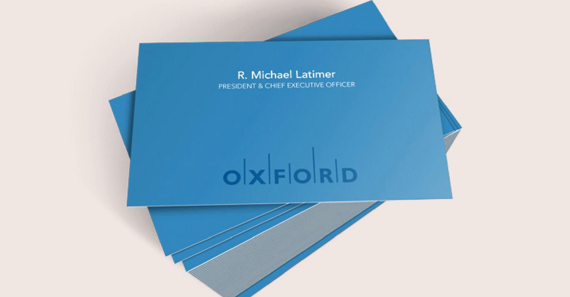
To expedite the stakeholder engagement process – essential to any thoughtful rebrand – we limited the number of interviews, and focused only on Oxford’s top executives. In a series of in-depth sessions, we gained insights into the company’s day-to-day operations (as well as its long-term goals). Within just six weeks, Works Design had approval on a new logo and corporate tagline, and in the 10 weeks that remained, we established a completely new visual identity system. This informed our redesign of Oxford’s key communications pieces (including the corporate website).
As a final challenge, it was important to Oxford Properties that the new brand be installed at every property simultaneously. It was an ambitious goal, but in keeping with Oxford’s property management commitment to excellence and consistency. All externally facing brand elements (signage, corporate collateral) were rolled over to the new identity during the course of one weekend in a carefully orchestrated install. It went off beautifully.
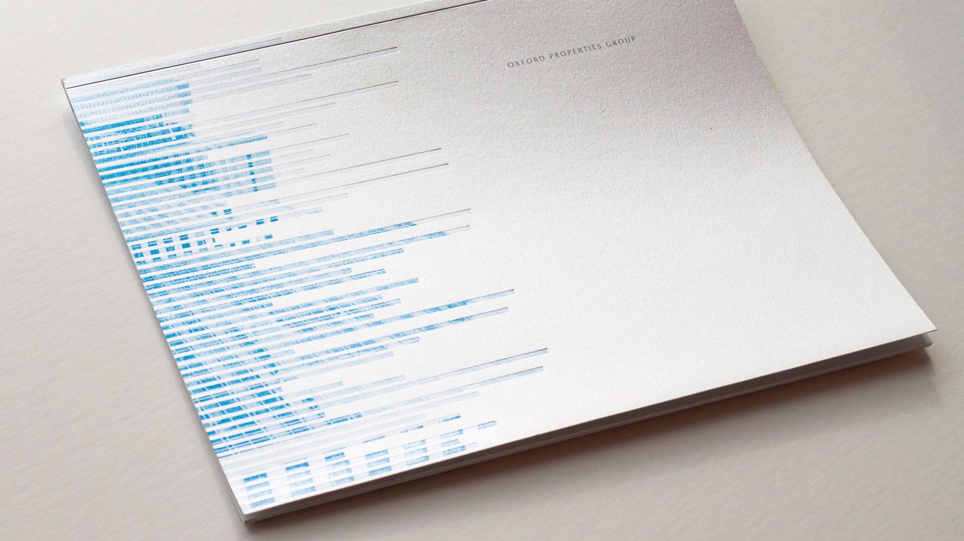
Sustainable Intelligence
Works Design later developed a sub-brand to represent Oxford’s sustainability activities. Oxford strives to be recognized by customers, employees, co-investors and the market-at-large as an industry leader in this area. In addition to producing an annual sustainability report, the company is known for fostering innovation in technology and building management practices. The Sustainable Intelligence brand provides a separate, defined banner for communications about these efforts.
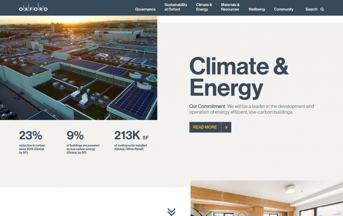
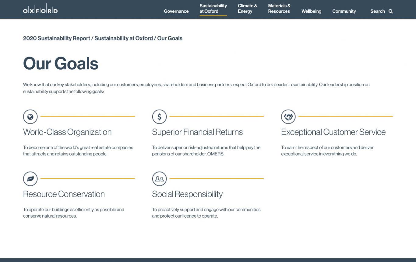
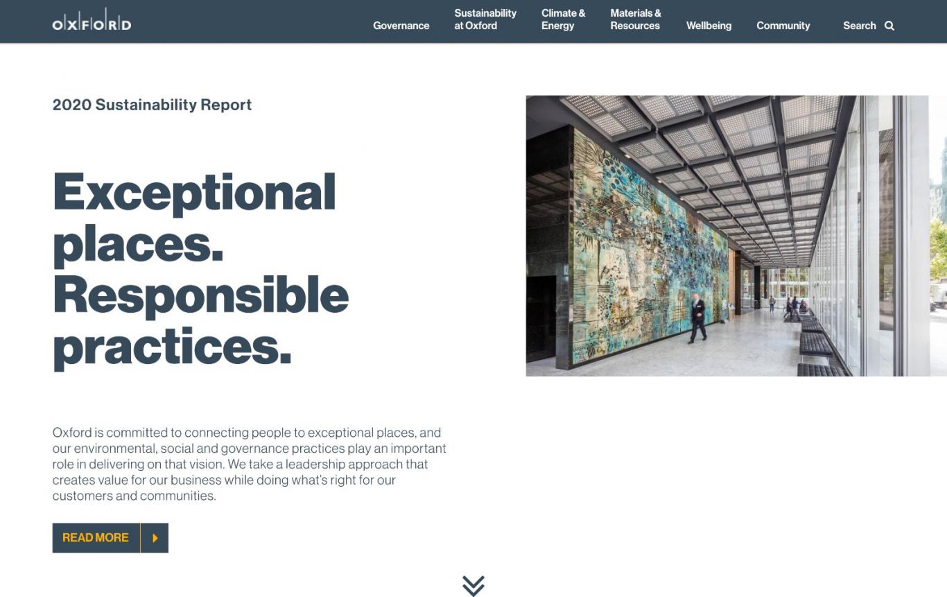
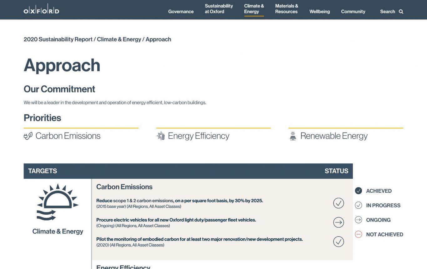
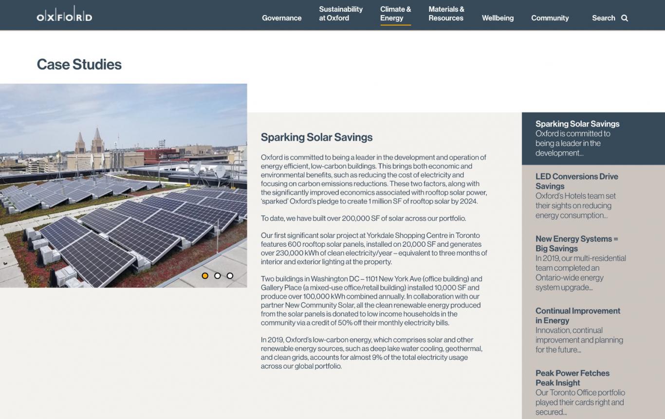
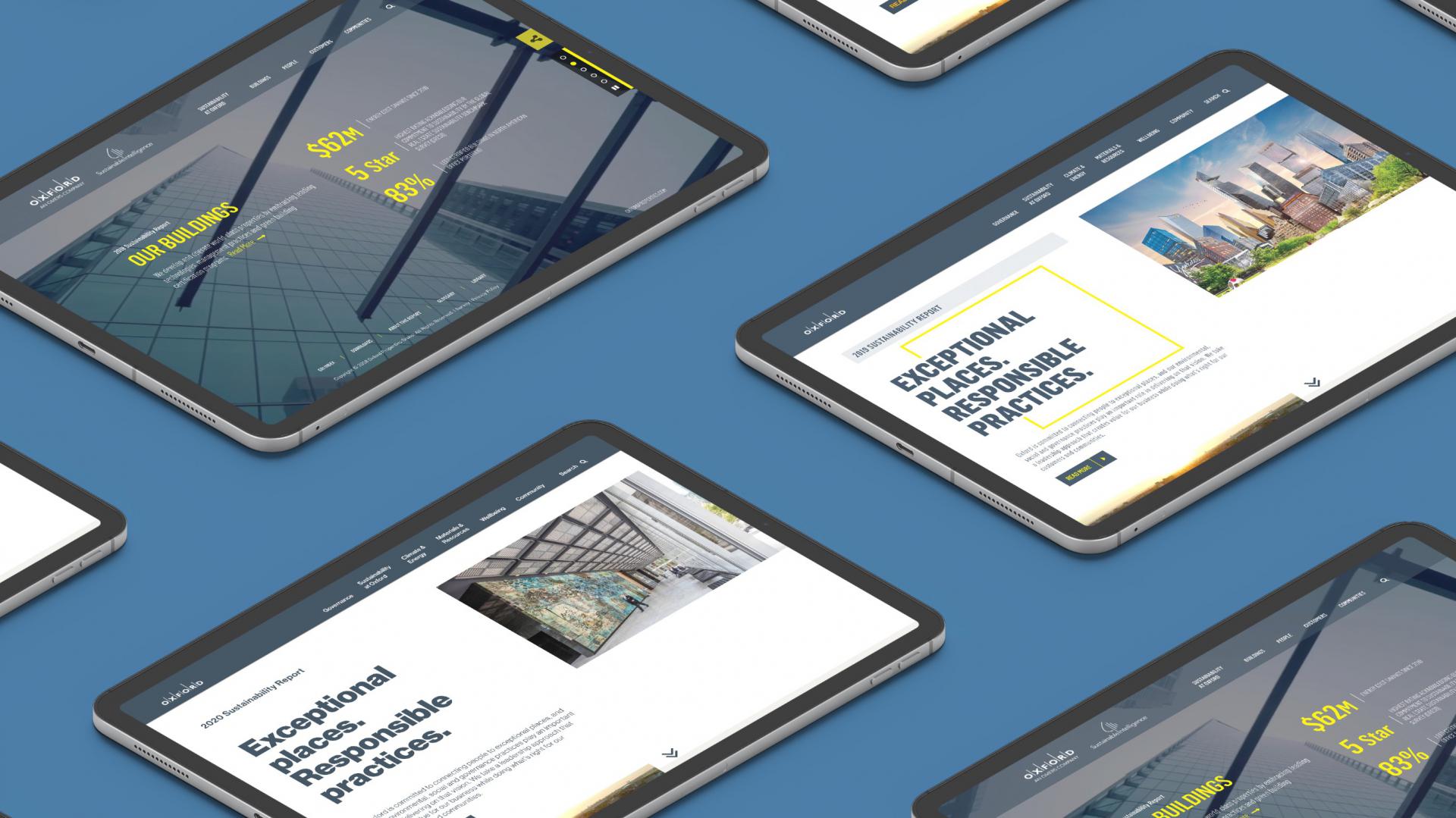
Since 2010, Works Design has also designed and developed Oxford’s sustainability report, which continues to offer the company an excellent opportunity to communicate its sustainability efforts and leadership to a wide circle of employees and stakeholders.
To ensure the report remains top-notch, its functionality and design is updated on a biannual basis. Priorities for the 2019 redesign included an overhaul of the navigation system and other design improvements aimed at improving overall usability. Updating the approach to key content pages (such as the homepage and Oxford’s case studies) ensures a clean, modern and high-end look.

